Unifamec: admissions website
An admissions website for a university center in Camaçari, Brazil, designed around the applicant's real question (how do I get in?) and built to generate audience data with every yearly campaign.
- My role
- Product Owner and UX/UI Designer
- Period
- 2026
- Client
- Unifamec
Context and problem
Unifamec is a university center in Camaçari, in the state of Bahia, Brazil, offering undergraduate, technology, graduate and Medicine programs. It had no website for its admissions process (vestibular): recruitment relied on advertising campaigns and direct contact.
The goal was clear: drive applications. And since the campaign was designed to run every year, the website also had to be a foundation for future editions.
My role
A freelance project run by two people: me and my business partner, a developer.
I was responsible for all the design and product decisions: understanding the audience, the journey, information architecture, interface and the scope of the first version. My partner built it in Next.js.
Discovery
Our understanding of applicants came from two sources:
- Conversations with the university's advertising and lead recruitment teams, who know the questions and objections of prospective students.
- Analysis of the client's context. Camaçari is part of the Salvador metropolitan area, and many local students commute to the state capital to study.
That led to the two arguments that shaped the site:
- Ease of admission. For many applicants, the first question is not "which programs exist" but "can I get in and afford it?". ENEM (the national exam score), FIES (federal student loans) and ProUni (federal scholarships) had to come first.
- Quality of life. Studying Medicine, among other programs, without commuting to Salvador every day is one of Unifamec's strongest differentiators.
Key decisions
Decision
Where should the journey start: the program or the admission route?
Options considered
- Start with the program catalog, like most institutional websites.
- Start with the admission route (ENEM, FIES and ProUni), with Medicine separated from the other programs.
Criteria
Discovery showed the main question was how to get in, and Medicine was the institution's biggest differentiator in the region.
Choice
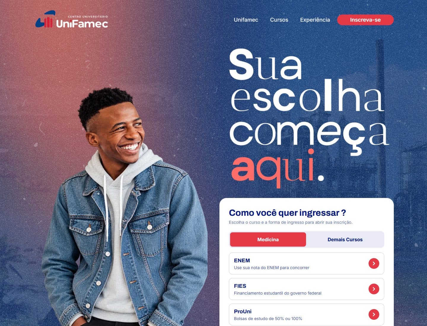
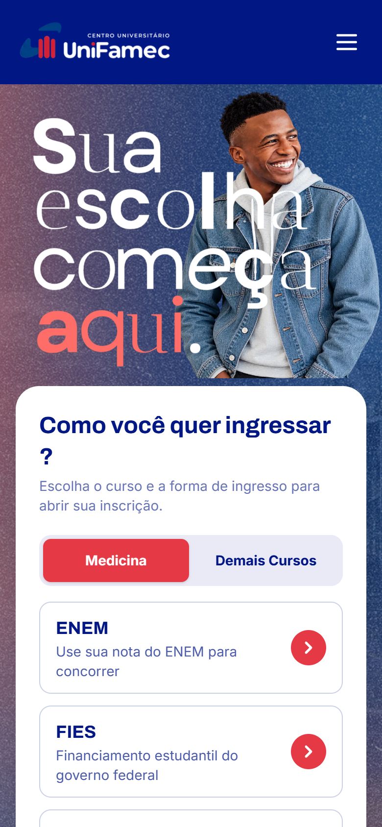
The "How do you want to get in?" block sits above the fold, next to the hero, with tabs for Medicine (selected by default) and Other Programs. Choosing the type of program comes after.
Trade-off
Applicants who already know their program have to scroll a bit further. In return, most of the audience gets an answer to their main question without leaving the first screen.
Decision
How many primary actions should the site offer?
Options considered
- Several highlighted actions: talk to an advisor, browse programs, book a visit, apply.
- A single primary action, "Apply", always visible.
Criteria
The site's goal is applications. Competing actions increase hesitation right when the campaign is running.
Choice
A single CTA, "Apply", fixed in the header. The rest of the page works to lead the applicant there.
Trade-off
People still researching have fewer shortcuts to get their questions answered. That role went to the content sections and the university's support team.
Decision
How do you win over someone who doesn't know the university yet?
Options considered
- Institutional copy: history, mission and differentiators.
- Visual proof: the campus facilities, student memories and the university's Instagram.
Criteria
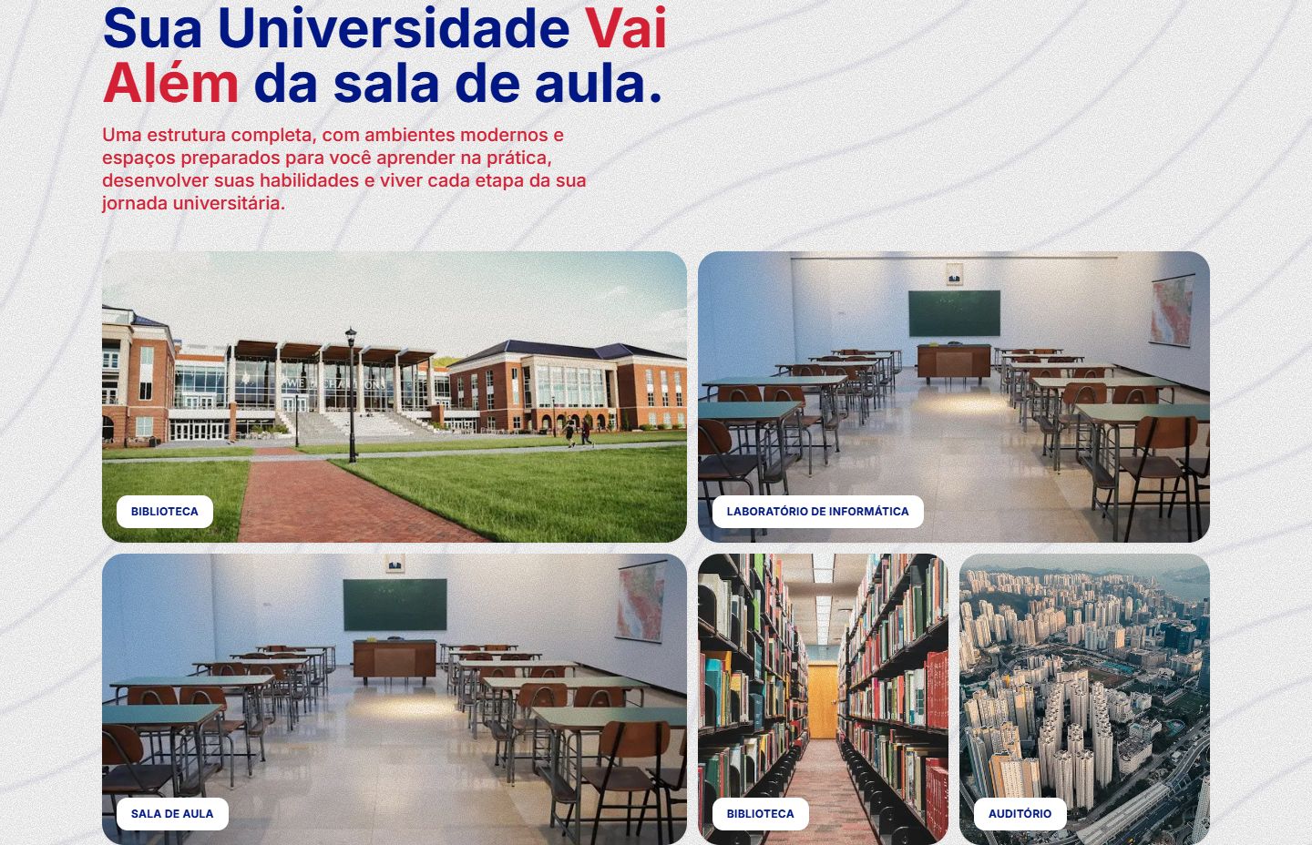
For a young, local audience, seeing the place and real people builds more trust than reading about the institution.
Choice
The "Your university goes beyond the classroom", "Memories we made together" and "Follow Unifamec" sections take the place of long institutional copy.
Trade-off
The site depends on real, good-quality photos that need refreshing every campaign.
Decision
Where should applicants go after the click: WhatsApp or a form?
Options considered
- Send applications to the recruitment team's WhatsApp, as originally planned.
- Send each admission route to its own form and measure the journey with analytics.
Criteria
During the project, the admission flow changed: each button now led to a specific form. That opened an opportunity. A WhatsApp chat leaves no structured data, while forms and analytics events show who is interested in which program and which admission route.
Choice
Forms reached through the admission buttons, with data collected through analytics so the university can understand the profile of interested applicants.
Trade-off
We gave up the immediacy of a WhatsApp conversation. In return, every campaign now produces information to plan the next one.
Delivery and validation
- Design and decisions: by me, validated with the university's advertising and recruitment teams.
- Development: in Next.js by my partner, with versions deployed on Vercel for client review.
- Mobile: the layout was designed for phones, where most admission-age applicants are.
Results
The site has not launched yet, so there are no application metrics to show. Once it goes live at vestibular.unifamec.edu.br, the university will track:
- applications by admission route (ENEM, FIES and ProUni);
- interest in Medicine compared with other programs;
- the profile of interested applicants, based on analytics data.
This case study will be updated with the numbers from the first campaign.
Learnings
- Think about data from day one. In a campaign that repeats every year, each edition feeds the next. Replacing WhatsApp with forms and analytics turned the site into a source of insight for the university, not just an application channel.
- Local context is a product argument. The site's most important decision, putting admission routes and Medicine first, came from understanding the reality of students in Camaçari, not from copying other websites.